


How to make the coolest visual brand for an NGO.
Credits:
Design Strategy: Relajaelcoco studio
Design Strategy: Relajaelcoco studio
Client: Ayuda en Acción
Design System: Relajaelcoco studio
Web Development: Lin3s
Project leaders: for Ayuda en Acción, Luis Palacios, María Díez, Rocío Melero
Design leaders: Relajaelcoco studio
Illustration development: Pedro Perles x Relajaelcoco
The Need:
Ayuda en Acción is a Spanish NGO that pushes for sustainable change, based on a long term approach to help communities and lead projects to create an independent self consciousness.
At the end of Covid-19 lockdown, they wanted to run their rebranding project for the entire organization with applications in 22 countries between Asia, Africa, Latinamerica and Europe.
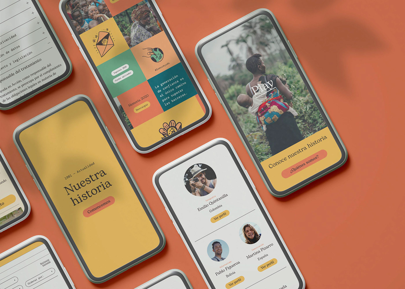
They wanted to update the brand to the digital era, starting a new communication to enlarge their main target to young people.


The Proposal:
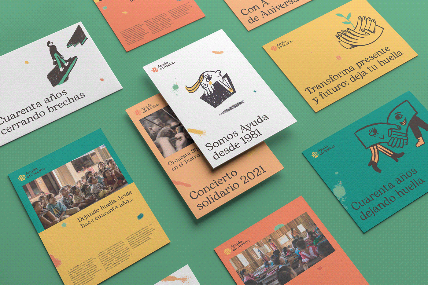
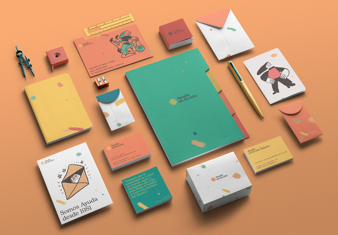
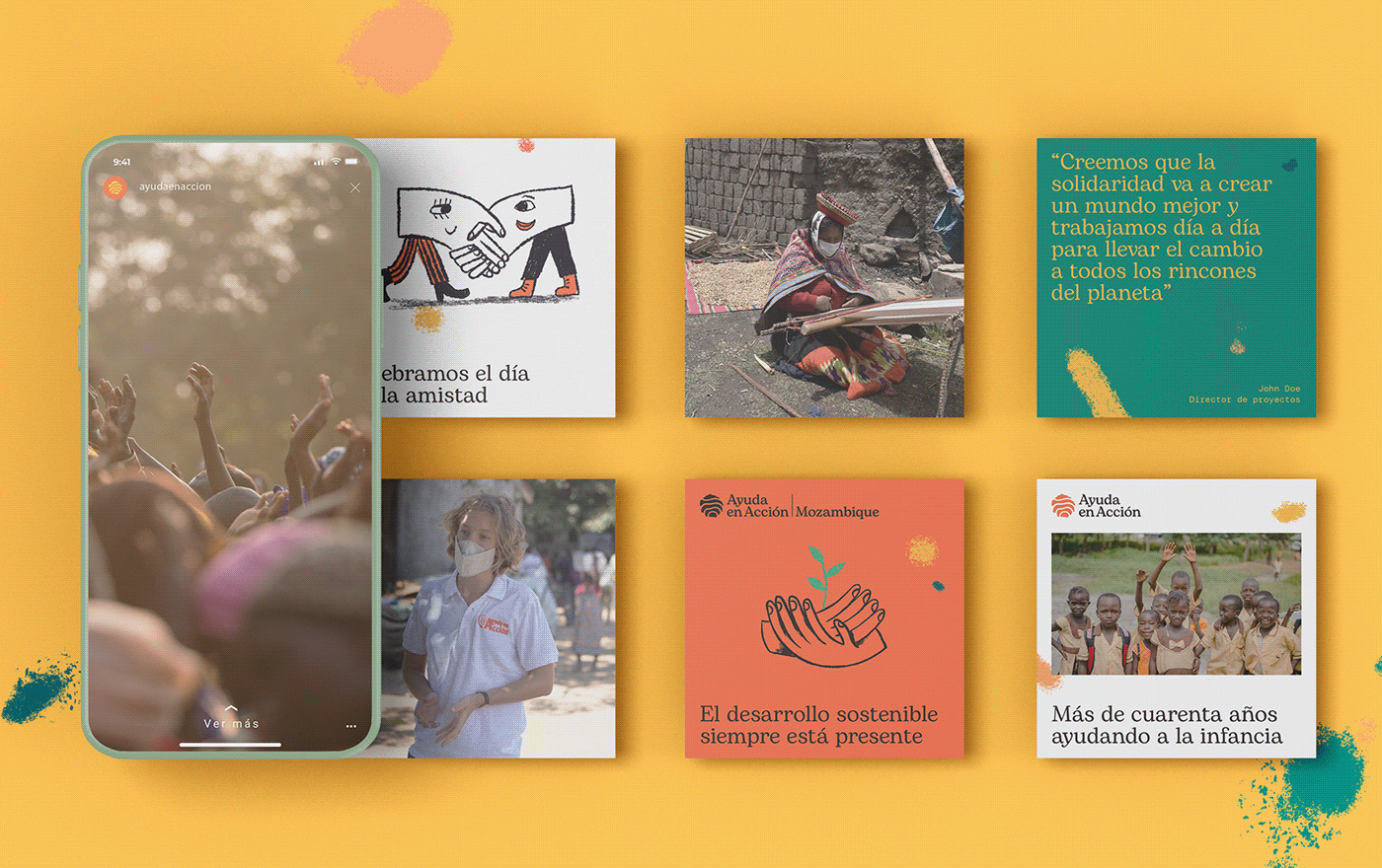
After two months working together defining the essence of the organization, we reached a solid proposal that translates the main values to a visual system based on the idea of Ayuda en Acción as a NGO that promotes a long life sustainable change in each community they act on. The result of this action is to leave a permanent mark.
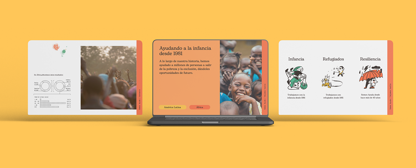
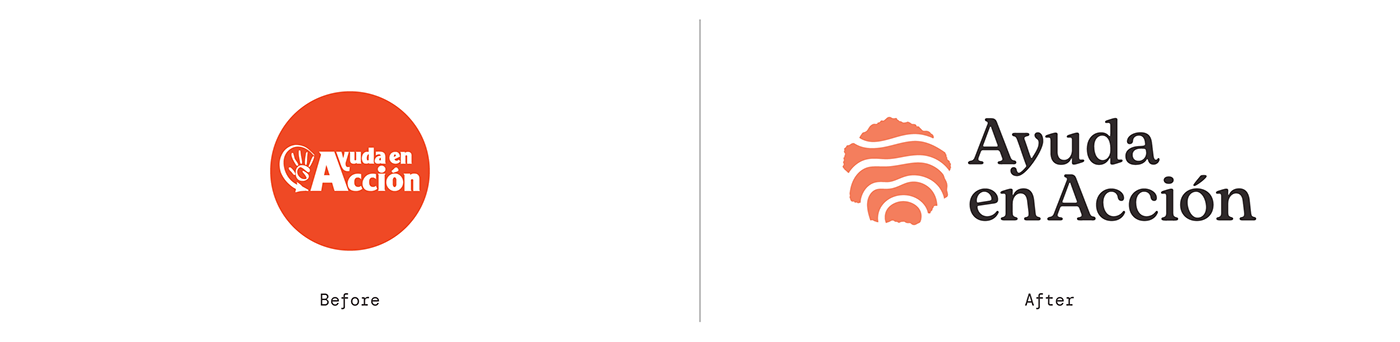
Our proposal was to update some old elements like the orange color. The aim was to structure a visual system based on beautiful typographies such as Bogart from Zetafonts and DM Mono from Colophon Foundry.
Typography is a key element in this visual system. Both Bogart by Zetafonts and DM Mono by Colophon Foundry define the two main nuances of the brand focusing on a digital approach and readability. We have been establishing that Bogart reminds a humanistic and close approach of the organization and the DM Mono is more focused on the professionality of Ayuda en Acción.
The Solution:
This project is the result of a collective effort of NGO members and Relajaelcoco to achieve a solid and versatile structure that provides a bold personality and a wide combination of visual elements that creates the new identity.
The aim was to supply the organization with a dynamic brand manual, based on positive inputs instead of prohibitions, marking a clear path. We have decided to use an interactive tool to let the brand manual be more efficient instead of a static PDF, enriching it with assets and materials that may help the daily life development of the visual communication.

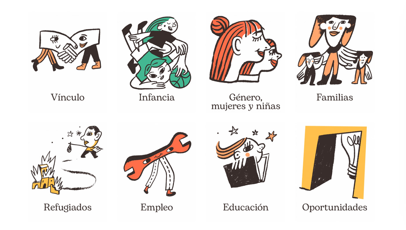
Illustration style:
The illustration style, made together with Pedro Perles, is based on a more pictorial approach to outline the primary essence that all cultures have in common.


Color:
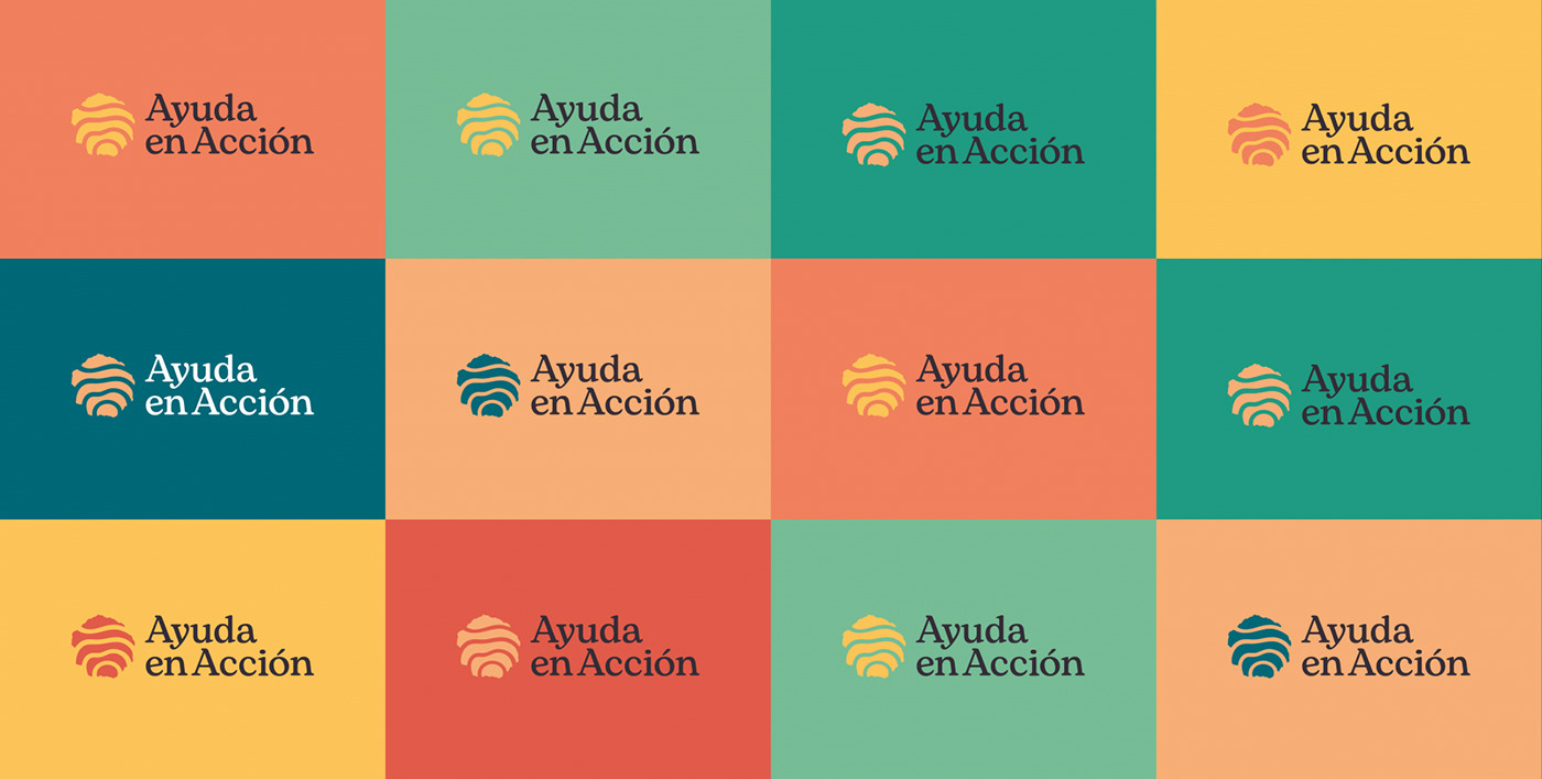
Orange is the main color of Ayuda en Acción and we have developed a rich color palette made of warm colors accompanied by some greens and turquoises resulting in the dynamic action of the organization as a change agent.
Color palette is based on vibrant colors but not as saturated as we are used to seeing in the NGOs sector.


The Goal:
The new visual identity treats a cosy and warm essence based on portraying Ayuda en Acción as the promoter of a sustainable change with a focus on youth. The new visual system is dynamic, not logo centric based and structured to be easy to use.


